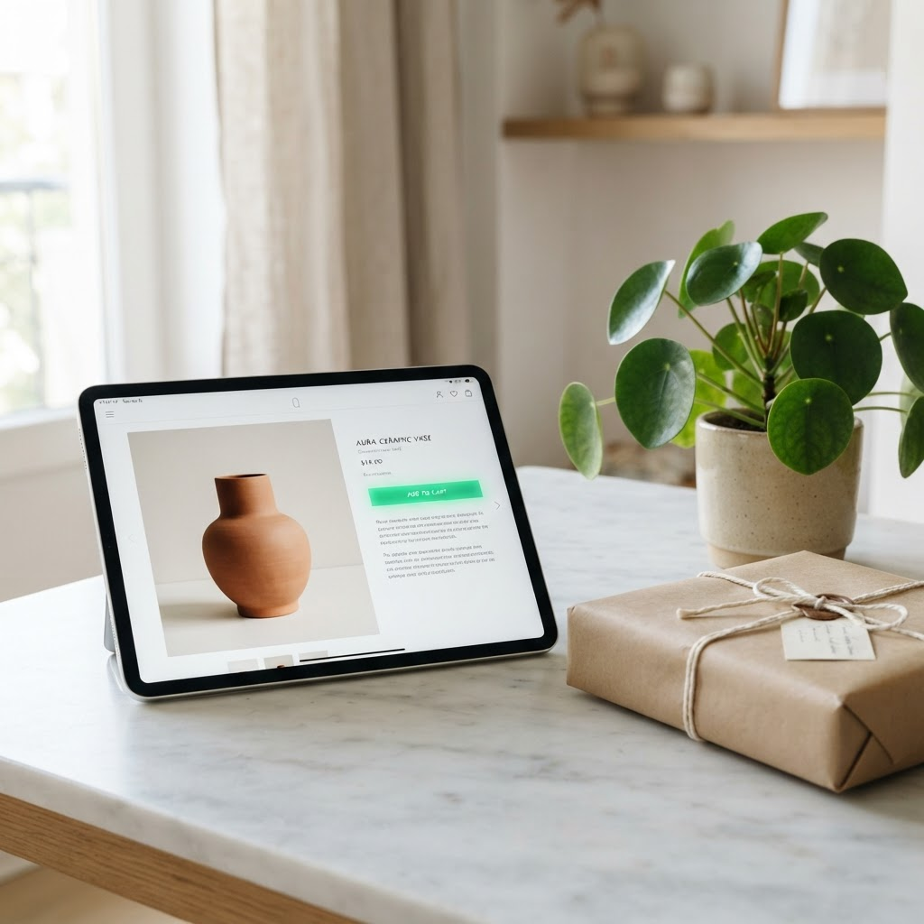
A great product page is not decoration — it is a sequence of answers to the questions a buyer asks in order. Here is that sequence.
A product page has one job: to move a visitor from curiosity to confident purchase. The best pages do this by answering the buyer's questions in the exact order they naturally arise. Get the sequence right and conversion follows.
The first question is always 'is this for me?'. Your hero — image, title and one-line value proposition — must answer that within seconds. If a visitor cannot tell at a glance what the product is and who it is for, they leave. Clarity beats cleverness every time.
Next comes 'can I trust this?'. This is where reviews, ratings, guarantees and trust badges do their work. Social proof placed close to the buy button reassures the buyer at the moment of decision, not buried at the bottom of the page where nobody scrolls.
Then 'what exactly am I getting?'. Clear specifications, honest photography, size and fit guidance, and shipping expectations remove the friction of uncertainty. Every unanswered question is a reason to abandon the cart, so answer them proactively.
Finally, make the action obvious. One clear, high-contrast call to action, repeated as the page gets long, with no competing buttons stealing attention. A converting product page is not busy — it is a calm, confident sequence that leads the buyer exactly where they wanted to go.
Written by
Ayesha Malik
Part of the delivery team at AXION GLOBALS PK, working directly on client web development engagements.
More from the team
 SEO
SEOThe Technical SEO Checklist That Actually Moves Rankings in 2026
Most SEO advice is content-first. But if search engines cannot crawl and understand your site, no amount of writing will save it. Here is where to start.
Read article Marketing
Why Your Meta Ads Plateau — And the Creative Testing System That Fixes It
On Meta, creative is the targeting. If your ROAS is sliding, the problem is almost never the audience — it is that your creative has gone stale.
Read article Web Development
Headless or WordPress? An Honest Guide for Business Owners
There is a lot of hype around headless and 'modern' stacks. Here is a jargon-free way to decide what your business actually needs.
Read article